When I considered testing all sorts of different film stocks I was kind of bored with Kentmere 400. It is by far the film stock that I shot the most mainly because it is cheap and decent enough. It is versatile, pushes well, dries flat and scans easily. Even after finding a developer that I liked with it, I wanted to try something new though. Since then I’ve been changing film stock every 15-20 rolls and I tested out all sorts of stuff. I tried Tri-X, RPX400, XP2, Double-X and T-Max 400 and now I’m in the middle of testing HP5+. My plan is to also shoot some Fomapan 400, Delta 400 and Orwo N74+ before I decide which of them might become my new standard emulsion. Right now I’m very much in favour of Double-X, but I will have to make a few more tests with push processing to see whether it holds up to all my uses and abuses. Also, since Double-X is cine stock and only comes in 400ft rolls or rather expensive pre-rolled canisters, I probably won’t get my hands on larger quantities anytime soon, since it will need a bit of an investment up front to buy so much film at once. I’m still considering the pros and cons. Despite all these considerations I went back to Kentmere 400 on a recent trip and was pretty happy with the results.
I tested another use for my newest toy today. You might know that I got myself a Jobo CPE-2 automatic film/print processor recently in an effort to streamline my process a bit and improve my colour development resultsas well. I already know that it works fantastically for C41 development and today I tried out to develop some black and white film with it. I don’t really have the right developer for it yet, but I was impatient and decided to try Rodinal 1:25 with a bit of medium format RPX400 to see whether it could be done or not. I still need to scan the negatives, but they definitely look promising. Rodinal is actually one of those developers that doesn’t do well with a lot of agitation, but someone mentioned to me yesterday that they use Rodinal and I just had to try. I will let you know what I think of the results after scanning.
All pictures taken with: Leica M6, Zeiss ZM C-Biogon 35mm f/2.8.
Kentmere 400 stand-developed in Caffenol-CL.
© Lilly Schwartz 2015
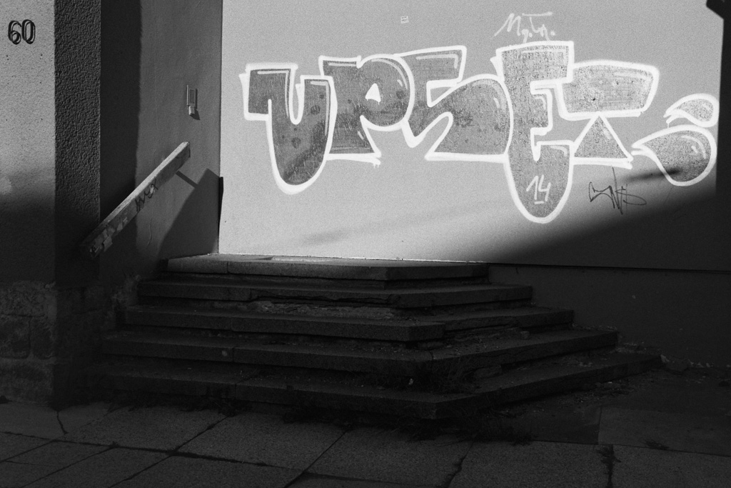
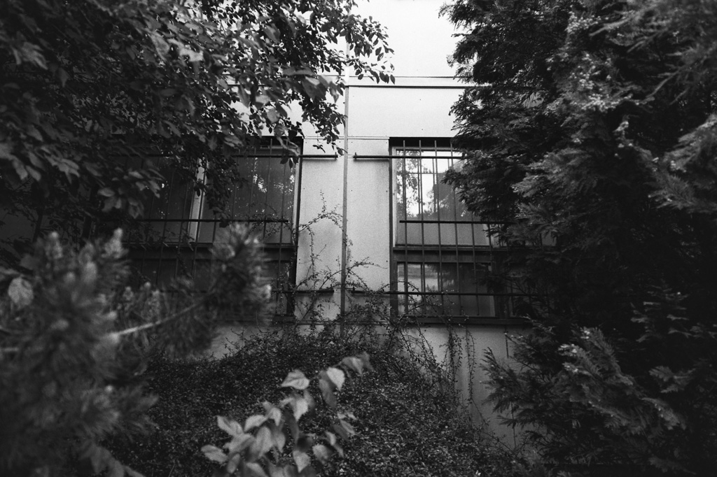
Upset about the stairs leading nowhere? I especially like that the intercom is still there.
© Lilly Schwartz 2015
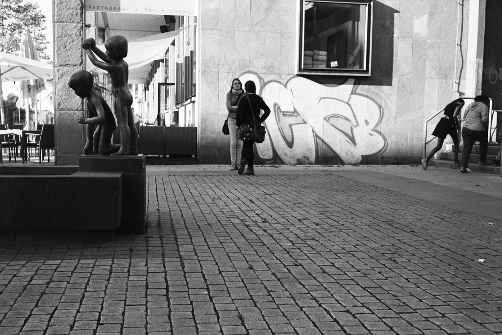
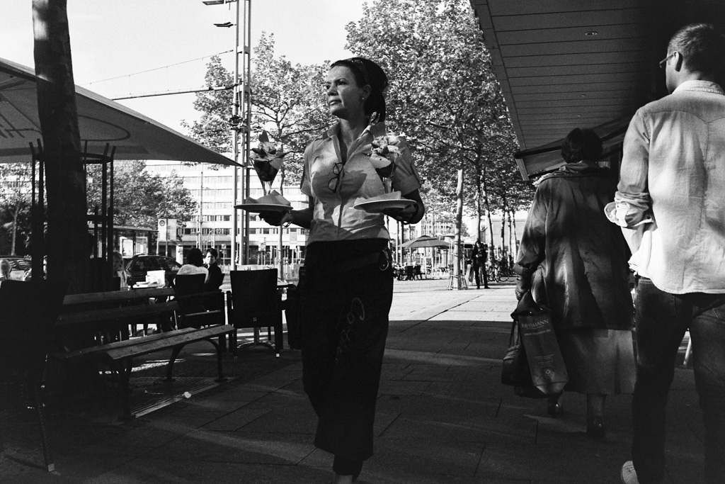
I think I might have lurked around for a second or two to get the right moment.
© Lilly Schwartz 2015
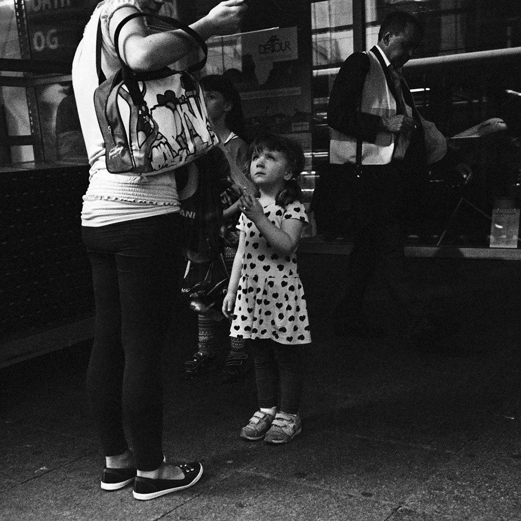
Yes, exposure slightly off … or completely actually. I liked the expression of the girl though.
© Lilly Schwartz 2015
© Lilly Schwartz 2015
Icecream done right.
© Lilly Schwartz 2015
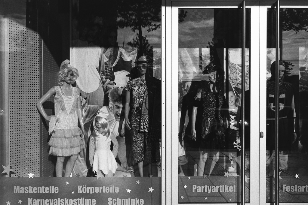
I found this highly disturbing … apparently they sell body parts too.
© Lilly Schwartz 2015
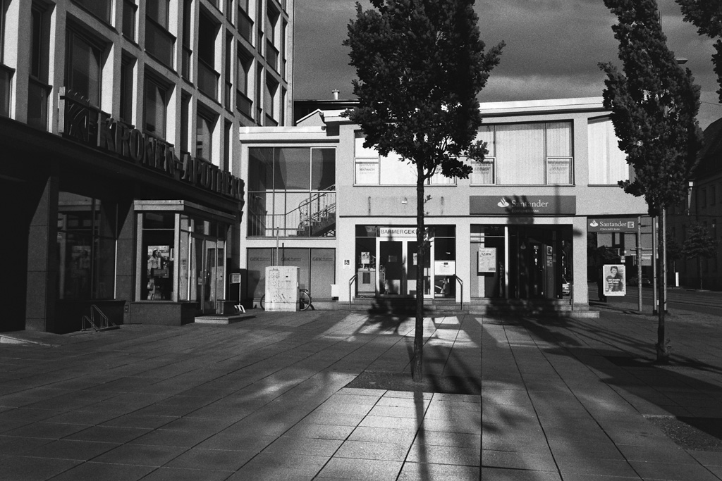
Beautiful light. It was the golden hour.
© Lilly Schwartz 2015
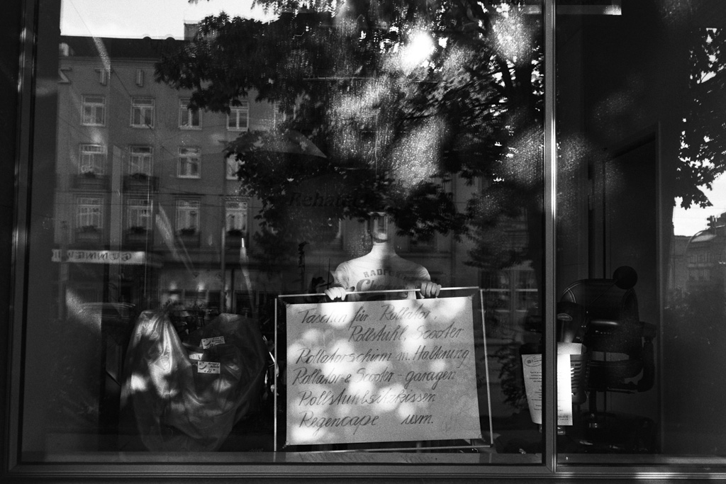
They sell wheel chairs and mobility scooters and the sign talks of a lot of accessories. I found the mannequin so weird though.
© Lilly Schwartz 2015
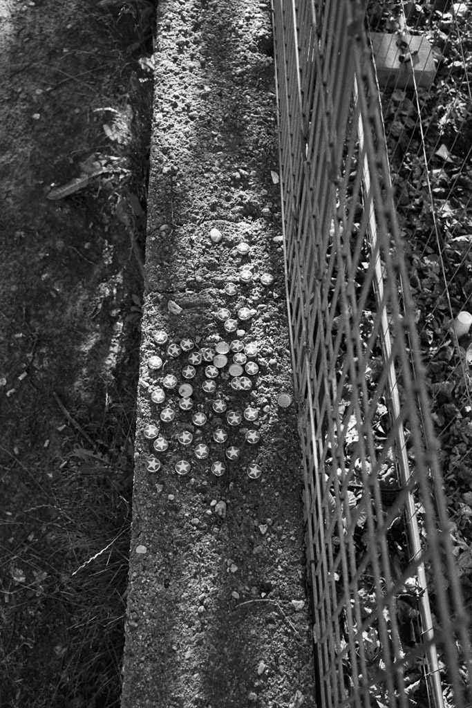
I was trying to get a good vantage point on an abandoned building despite a fence, so I climbed around a bit. Someone apparently had a lot of Sternburg beer.
© Lilly Schwartz 2015
I love the out of focus areas my Zeiss produces. f/2.8, it was already getting dark.
© Lilly Schwartz 2015
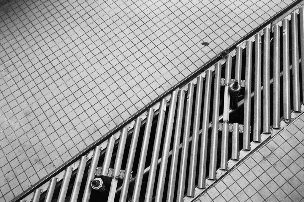
Do you want to take a guess what this is? Apart from stuff that tickles my black and white spidey senses of course.
Is It a street fountain ,
I love your work and the level of contrast you get , this is what I aspire to in terms of contrast , but currently can only get it with a little post processing in Lightroom
Thank you so much! Yes, it’s a fountain. Well, there is obviously post-processing necessary here too. Whenever there is scanning involved it’s necessary or you will have to rely on the usually very bad adjustments of the scanner software. What I usually do is to overdevelop my negatives a tad to get more shadow detail and then scan at the lowest contrast setting. The result will be very flat, but with lots of detail. I then introduce the contrast again by adjusting the levels when I do the dust removal. This way I make sure that I can keep as much detail as possible while getting the contrast I want. In the darkroom I would use filters or graded paper for the same purpose.
A really nice set of images, Lilli. Really nice. I particularly am taken by the photo of the star buttons (?).
Good tip on scanning properly. I always see this rich B&W and never quite know how people achieve it without losing the shadow detail.
Thank you Hernando! The star buttons are actually caps of a local brand of beer called Sternburg (“star castle”). Of course when you scan like I do you need a scanner with a bit of latitude that can handle the contrast. If it can’t deal with it in one go you can also try a scanner software that uses multiple passes. It usually brings out the shadow details a tad better than just with a single pass. In this case this was just a standard Pakon scan with the contrast all the way down. The Pakon definitely handles high contrast better than my Epson v700 which needs multiple passes and quite a bit of fiddling to get the same rich results.