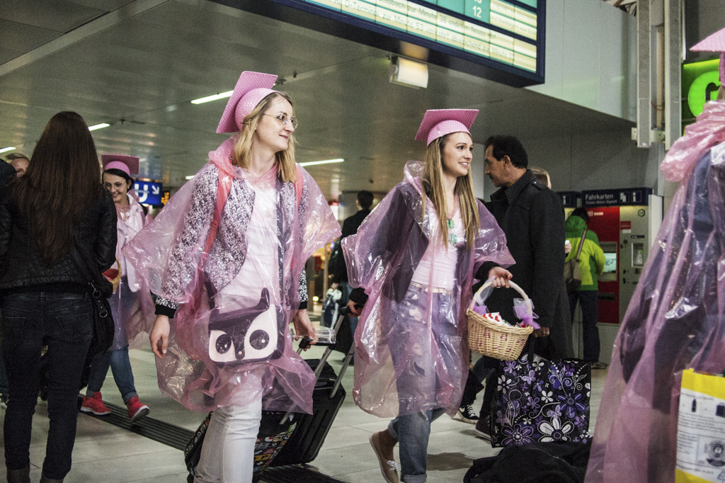
You are probably shocked and appalled now. There are two street pictures in COLOUR on my blog! Before you think that this might become a more regular sight, let me assure you that it is quite likely an exception. For the first one my dad insisted that it should be in colour and I understand his reasoning. In fact, I have been a little too radical in my preference for black and white and have occasionally converted pictures to black and white where they clearly lose a part of their story in the process. I’m trying to ease up on this a little bit and have decided to leave the picture in colour if and only if the colour adds something essential to the story in the picture or if it is harder to understand in black and white. In my experience this doesn’t happen very often.
Colour is actually much harder to control and black and white, especially if the sensor isn’t too great. Especially at high ISOs the colours of my Olympus are horrific and even when the ISO isn’t the problem, the colours usually need serious corrections. That said, almost the only digital sensor I know which doesn’t bungle the colours in the most horrific way is the Leica M sensor. I don’t know what it is, but in most other cases even with perfect white balance there is something odd going on with digital colours. Maybe it’s the lack of IR filtration in most sensors. In this case I spent quite a bit of time correcting the colours and then produced the look I wanted with a Kodak Portra filter in Alien Skin Exposure. If I’d shoot colour film I’d probably shoot Ektar, but the Ektar filters in Alien Skin Exposure are rather too lo-fi for my liking.
All pictures taken with: Olympus Pen E-PL3 and Panasonic Lumix 20mm f/1.7 ASPH.
© Lilly Schwartz 2014
There was a whole bunch of these pink girls around and I’m not sure what the meaning of their outfits was. Normally such outfits indicate a bachelorette party.
© Lilly Schwartz 2014
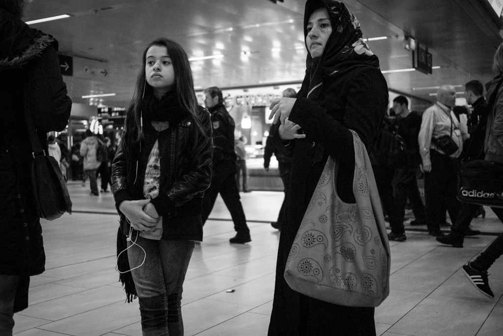
The girl has a very dignified expression.

© Lilly Schwartz 2014
It could have been such a great picture if it weren’t for the sad quality of low ISO shots on my Olympus.
© Lilly Schwartz 2014
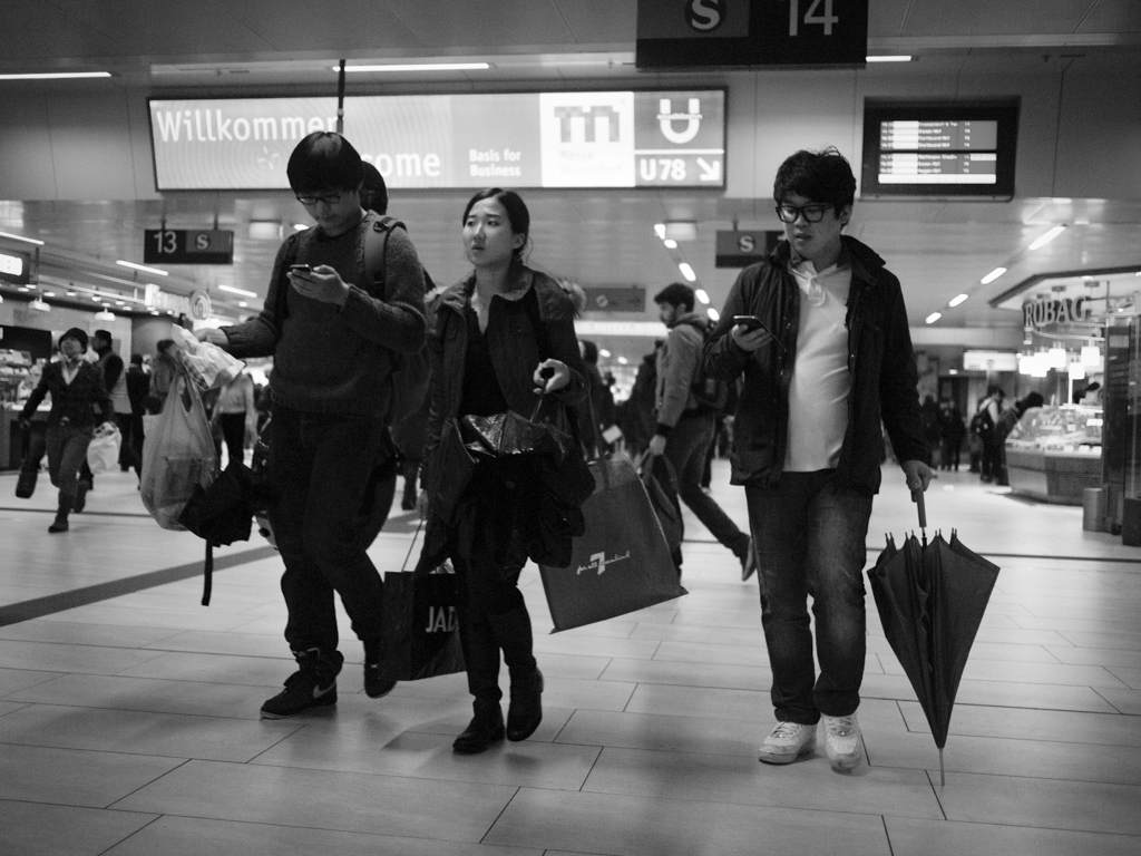
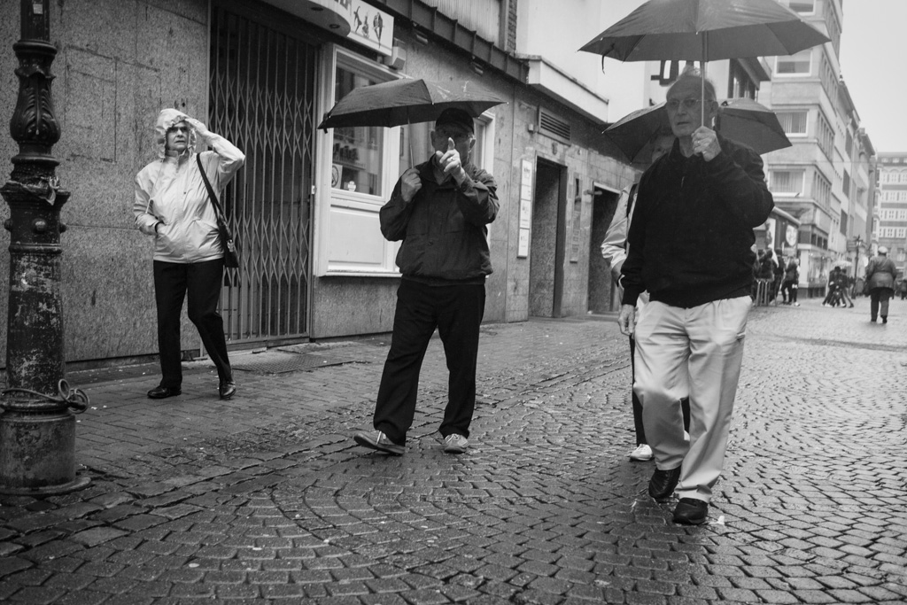
At least one of them is looking where she is going.

© Lilly Schwartz 2014
Looks like there is going to be a party.
© Lilly Schwartz 2014
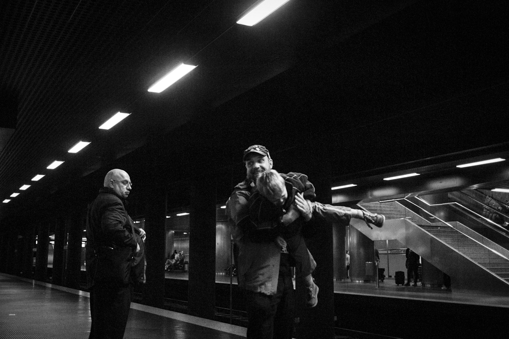
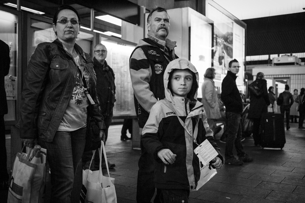
The little boy was not pleased. He was actually crying moments later.
© Lilly Schwartz 2014
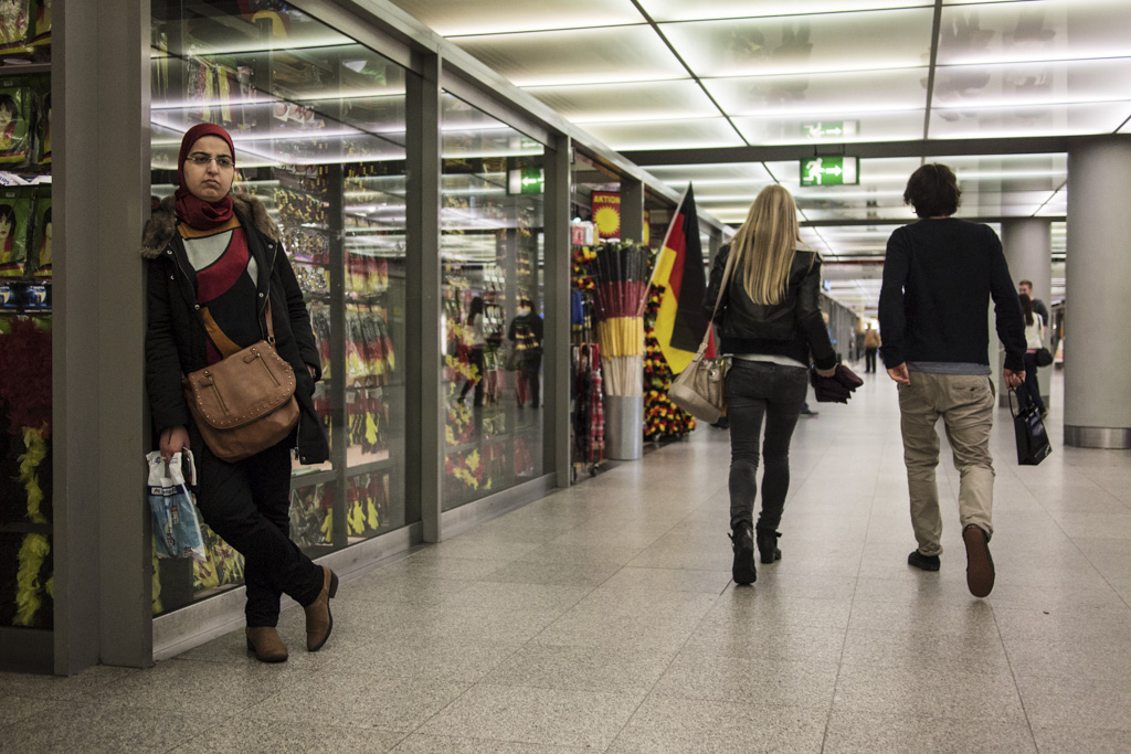
Football (soccer) world cup approaching. This time in colour.
© Lilly Schwartz 2014
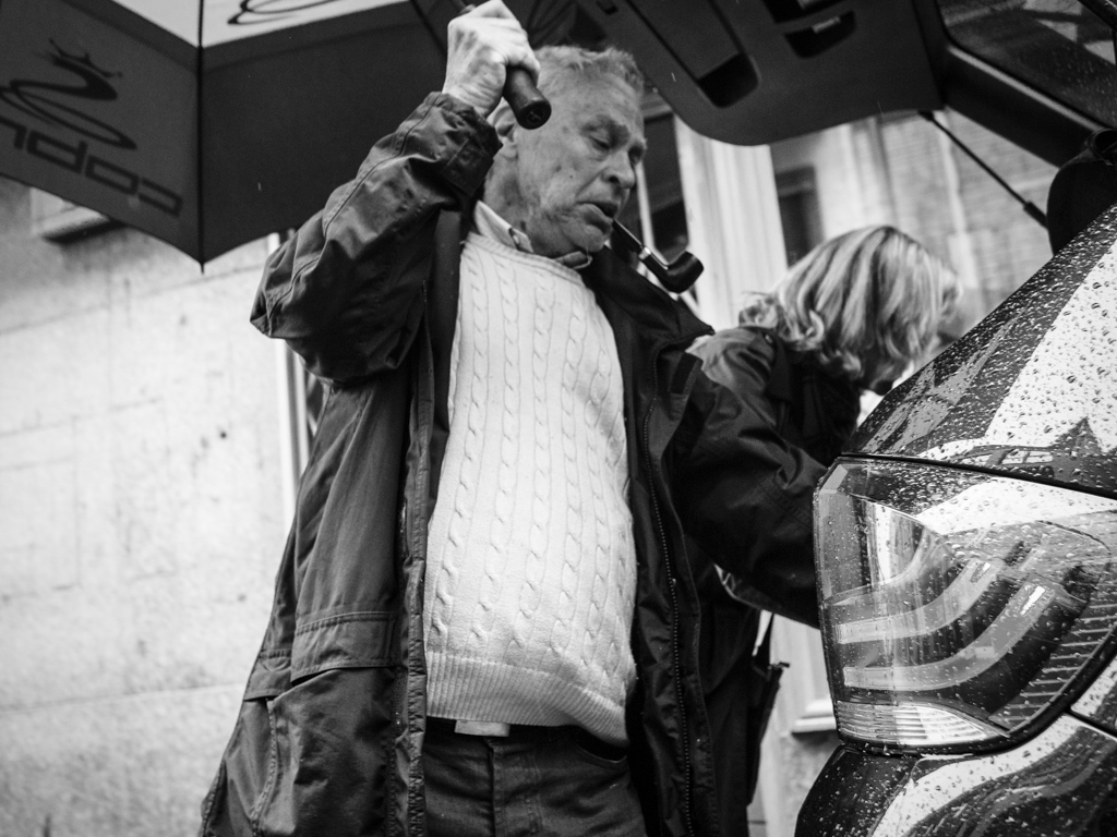
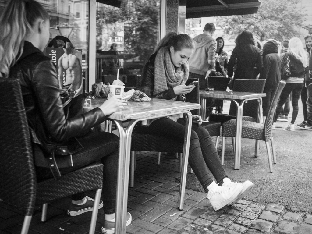
For some reason I love this picture. I have no clue what it is. Do you?
© Lilly Schwartz 2014
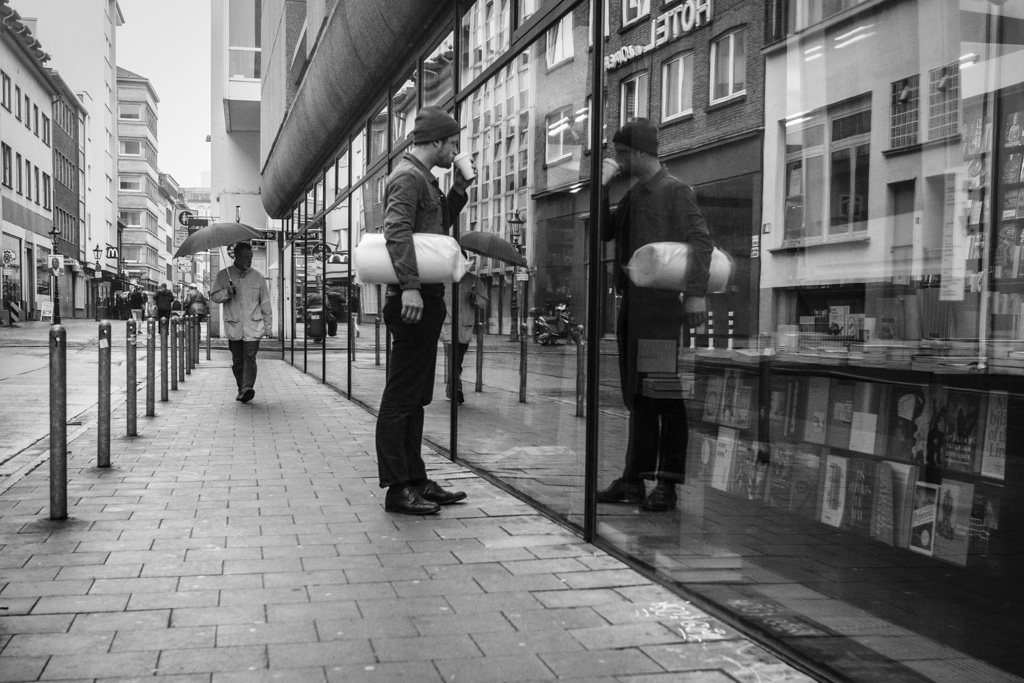
Coffee and books. It’s an art book store actually.
© Lilly Schwartz 2014
© Lilly Schwartz 2014
Censorship.
© Lilly Schwartz 2014
Bored girls.
© Lilly Schwartz 2014
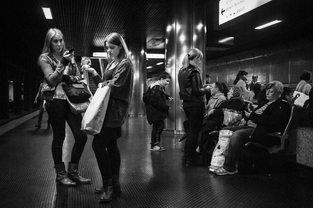
They were coming from some sort of fair.
First:
Weird clad girls in color – every time & everywhere!
World championship (in color) – Nope
No.3: the grain adds a dungeon-like ambience. In my opinion its an enhancement to the look and especially feel of the shot (bute the key is intention).
No.8: Because the person is really the center of the image and you can directly experience his mood?
And I like the sequence of 11 & 12