The other day I felt like testing my new Industar 22 lens, given to me by my friend Damien. Well, so far so good, but it was actually a silly idea, since I was shooting Tri-X that day. It curls like crazy and therefore is a real pain to scan. No way to assess whether anything is sharp at all. Lately I’m actually developing a fondness for the tonality of Tri-X, at least in examples online. So far I only got one roll of Tri-X to look the way I like it with Rodinal by accidentally underexposing it a stop, but I’ve so far failed to reproduce the look. Tetenal Ultrafin doesn’t do too well with Tri-X in my opinion, so I should probably try out a different developer as well once I run out of Ultrafin. HC-110 for example. If I want to shoot more Tri-X, I definitely have to solve the problem of how to get it to lie flat on the scanning surface as well. Probably the reason why I haven’t put much effort into finding the right recipe for Tri-X yet.
The sharpness issues weren’t the only problem with this particular roll either. In fact, I also didn’t trust myself too much with my exposure guessing abilities and decided to push the roll a stop, because it was a rather gloomy day. Well, it turned into a consistently overexposed roll, because Ultrafin isn’t very forgiving when it comes to mistakes. I guess my guesstimation skills have improved without me noticing too much. I should have just trusted myself more.
All pictures taken with: Zorki 4K and Industar 22 50mm f/3.5.
Kodak Tri-X EI 800 developed in Tetenal Ultrafin 1:10, 13.5min.
© Lilly Schwartz 2014
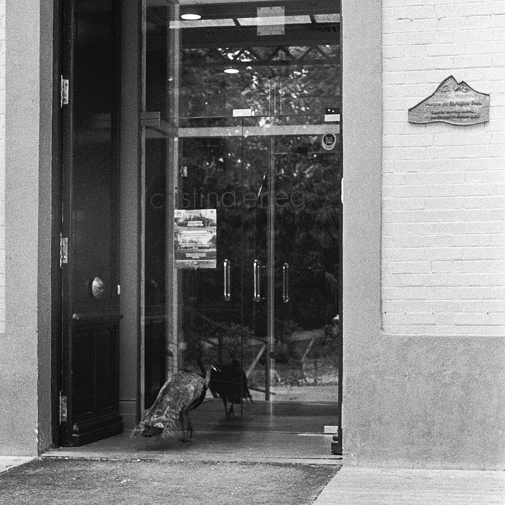
This one was relatively flat. Peacock trying to go into a building or looking into the mirror?
© Lilly Schwartz 2014
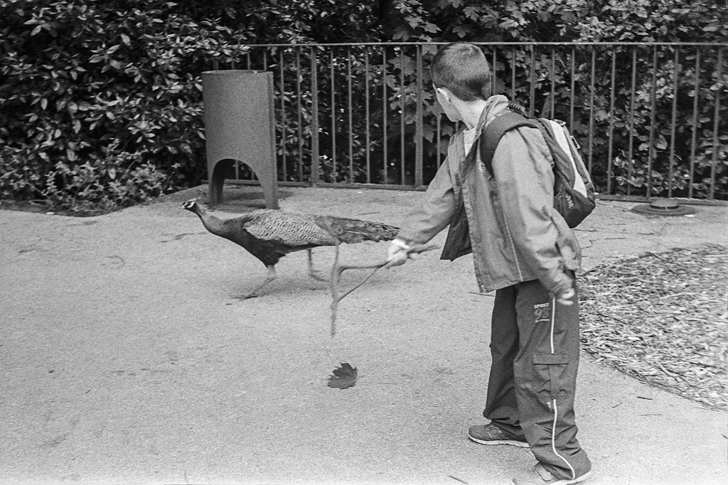
What’s it with kids and scaring animals? The peacock wasn’t impressed.
© Lilly Schwartz 2014
© Lilly Schwartz 2014
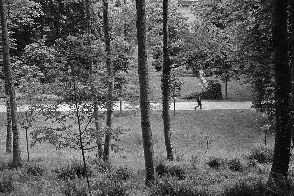
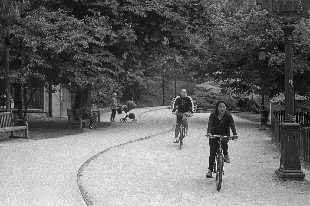
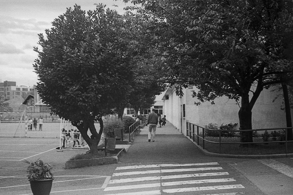
Ah, curved lines!
© Lilly Schwartz 2014
Levitating kid in the background.

© Lilly Schwartz 2014
Not sure whether it’s a scanning problem, a focus problem or the sharpness of the lens. It might actually be a combination of all three.

© Lilly Schwartz 2014
Here it seems quite sharp … at the bottom and top edge that is.

© Lilly Schwartz 2014
If there is a sign that tells cyclers to dismount, then obviously that’s no reason to dismount …

© Lilly Schwartz 2014
Alien language.

© Lilly Schwartz 2014

© Lilly Schwartz 2014
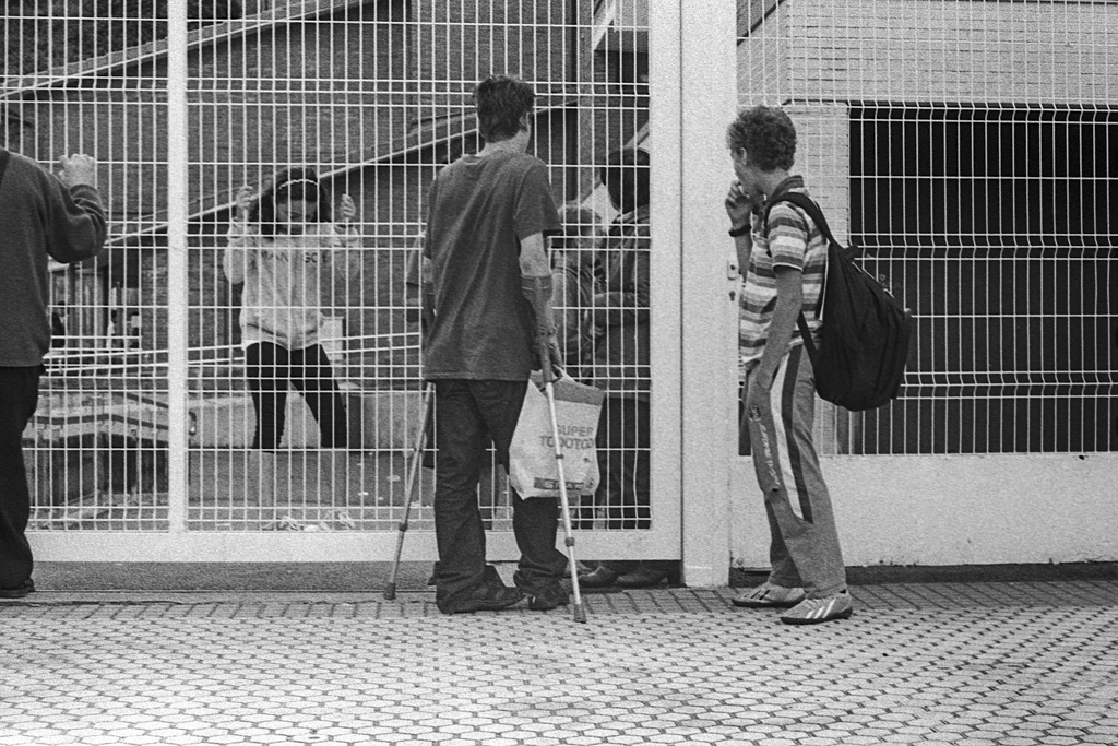
Is it me or does a wheel chair seem a bit excessive for a broken foot? Or maybe it’s unrelated?
© Lilly Schwartz 2014
This is so weird! When you don’t look closely it seems as if her legs end with her leggings.

© Lilly Schwartz 2014
Shooting from the hip with a 50mm lens needs a little practice I guess.

© Lilly Schwartz 2014
I liked these pictures a lot per se, but can’t say the same for the analog results 🙁 Inter alia, a bit too grainy for my taste. Way back in the late seventies, my crowd used ORWO B&W cine film — we’d jointly buy a 100′ roll and share it among ourselves, loading our blank (salvaged) 35mm film cassettes with the help of our individual film bulk loaders.
Exposed at 125 ASA and developed in a very basic metol + sodium sulphite developer, we’d usually get clear, ‘transparent’, finely detailed negatives with very good tonal range that printed really well ! It also helped that most of us used Nikons or Minoltas with the best lenses they produced. What fun it used to be, in the good old days 🙂
I agree 100% with you on this. Such a bad combination of mistakes and technical difficulties. Overdeveloping and then compensating the bad scanning properties by overly sharpening them to get them halfway sharp makes for very grainy results. Factor in that this is Tri-X, which is a grain machine under the best of circumstances and you see why these are so grainy. And did I mention the bad fit with the developer? Ultrafin liquid doesn’t deserve the name anyway! For Kentmere 400 I get much less grain by stand-developing in Rodinal. One day I’ll get Tri-X right. So far I only got it almost right once, apart from a little too much contrast: http://www.lillyschwartz.com//wonderland/
Grain as style – I like it!
Too bad, you told us that this was not intention 😉
Why ‘..a bad combination of mistakes and technical difficulties’?
Well: If I want a perfect (whatever that means) reproduction – I will use my digital Fuji and ‘point and click’. And forget about grain, aperture, developer and so on…
But thats less fun. And: The shot is done by the cam and its microprocessor, not by us – our eyes and our brain and emotion and our daily mood.
Fun, emotion, intention, skill, a little bit of ‘technique’ and ‘fortune’ (both in its french meaning) – thats leading us to art.
Warhol shot pictures with a SX-70, far, far away from perfection.
Stick to your doing and you will find people who like it. I’m interested in your perception of reality and being. I’m also interested in gear and technique talk. But I would like to pin the shot with the peacock and the kid to my wall, with all the grain and un-sharpness 🙂
(Sorry, no native speaker, hoping you got my intention.)
Ah, Ralf, you know my pictures and so you know that I don’t go for the grungy holga look most of the time 😉 Of course, grain, blur and all that can be amazing, if it’s intended. One should be in control of such things and employ these as needed and not be a victim of it. I gladly admit to mistakes and here it’s rather obvious: somehow I can’t get the Tri-X tonality and grain to be as beautiful for me as it happens to work out for others. One reason why I’m mostly shooting Ilford film is because I actually manage to get it to look the way I want it to look, both with Rodinal as well as Ultrafin. With both developers Tri-X just refuses to play nicely with me though. I guess I’ll need to experiment some more with different developers. Maybe one of the Kodak developers does the trick. That’s why the non-standardised black and white development is so powerful: it can totally change the look and feel of the images! That’s why I insist so much that you should try developing yourself! Tri-X developed in Rodinal is very different from Tri-X in D76 or HC-110. Finding the right recipe is obviously not a quest for perfection – then I would shoot sterile Delta or T-Max and develop in a specific fine grain developer. It’s a quest to make it look the way I want it to look.
As for a print of the peacock and the kid for your wall: That could definitely be arranged 🙂
Hmm, ok. Nevermind: I do not expect you to do grungy pictures 😉 (if you do not like to…). But the pictures of this series create some effect that I like – thats it.
And of course – take me by surprise 🙂 (waiting every day for a new series…)
And as I started: the key is intention, right.
And of course (second) – do your best, that will satisfy you and us (big fat grin).
Tell me more about arranging…
(Coincidence: Grunge -> Nevermind -> Nirvana wasn’t that bad. I’m in a somehow naughty mood tonight)
Ich muss mich korrigieren: Der Look ist nicht ‘grungy’, sondern organisch – die Bilder erhalten einen Hauch von Leben.
Definitiv nicht lomografisch! Und es ist kein Fehler mit dem Werk zu arbeiten.
Organisch … das mag ich 🙂 Generell ist es auch gar nicht so sehr das Korn, das mich hier stört. Bei K400 ist ja Ultrafin liquid auch eher überdeutlich was das Korn angeht und das mag ich eigentlich ganz gerne. Es ist eher die Tonalität, die mich hier stört. Alles ein wenig platt und matschig in den Mitteltönen und das sieht man bei Tri-X auch ganz anders mit anderen Entwicklern.
Und nö, Nirvana war gar nicht mal schlecht. Der Hype war aber dennoch übertrieben und lag eher am “Suizid”. Ein wenig wie mit Werther 😉
Tja, wir nähern uns wieder an. Den überlieferten Hype um W. hab ich nie verstanden. Hat allerdings in beiden Situationen das Ziel erreicht.
Aber mal ein anderer Ansatz zu ‘Warum Analog?’:
…wer unsere Wahrnehmung schärft, richtet sich gegen unsere Gesellschaft. Selten “gut angepasst” kann er sich nicht mit dem abfinden, was aktuell und modern ist. Solche Menschen verbindet oft die Fähigkeit, Umwelten so zu sehen, wie sie wirklich sind.
(ISBN 978-3-608-50311-1, S.88)
“Wir haben keine Kunst. Wir machen alles so gut, wie wir können.”
(Dito, S.137)
Die Sätze sind ein paar Jahre alt und gnadenlos und brutal aus dem Zusammenhang gerissen, aber nicht geguttenbergt! 😉
Ja, für mich steht Wahrnehmung vor Technik!