A little while back I finally had a major breakthrough with the story for my comic. I’ve been thinking about it for quite a while already and I just couldn’t really find the right angle on it for a long time. I was still unsure about the whole world where it was set and even the main character eluded me. I knew that it would have animal characters and the rough topic of the story, I also knew that there would be space ships involved, but beyond that I was still terribly stuck. I tried to get ideas by coming up with different animal characters, which only confused me more. In the end I put down the pen for a few months and waited it out. Trying to force inspiration just won’t work, so sometimes you just have to step back and let the mind rest until the spark of inspiration comes. And then a couple weeks back, late at night, the solution finally popped into my head while I wasn’t even thinking about it. I won’t reveal any details yet, but let’s just say that one idea led to the next and within a couple of days I had a proper story with a loose timeline, a resolution and a hero to face all these challenges. Now, the details are still a little sketchy and might change as I develop the story further, so my work on the story isn’t done by any means, but I feel suddenly unstuck! And it immediately inspired me to draw and paint again!

© Lilly Schwartz
I felt in the mood for painting trees, more specifically Gingko trees, because they will play an important role in my story. So I pulled out some Koh-I-Noor watercolour pencils and my favourite earth tone palette which I built after reading a really excellent book on colour called Exploring Color Workshop by Nita Leland. If you ever wanted to get into watercolours or painting in general, this is the book to get, it explains everything about mixing colours! In fact I find it also really useful for colour photography because it explains which colours go well together and why. As you might remember from long ago, I actually really struggled with colour when I first started with C41 film. This book would have been so useful back then! Although a lot of the information and palettes described in the book are geared towards water colour the medium doesn’t really matter all that much. Most exercises are pretty universal and could probably also be done with a camera.
© Lilly Schwartz
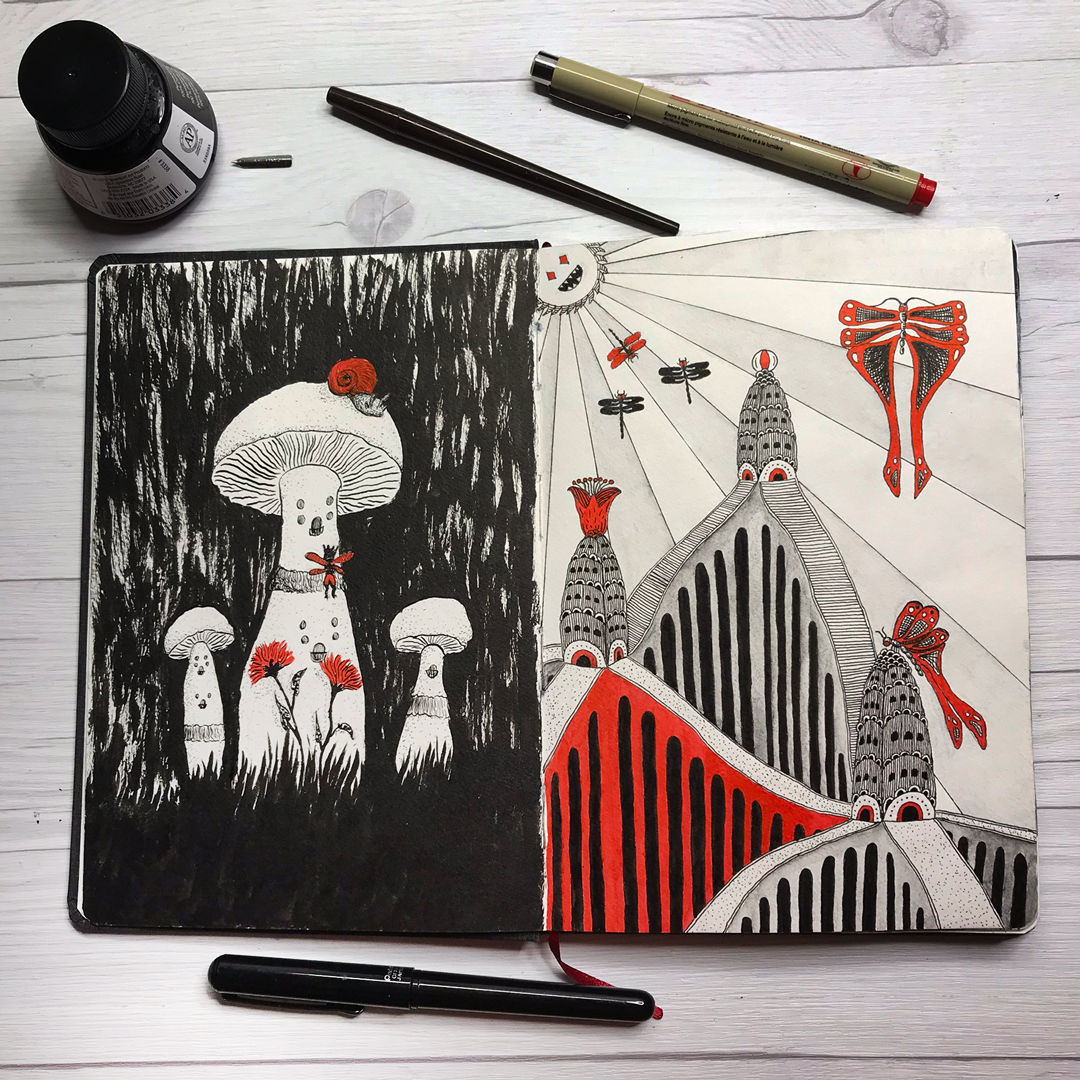
Since I was already painting, I was looking through my favourite Hahnemühle A5 watercolour sketchbook and I realised that there were a few empty pages that needed filling, so I let myself be guided by whatever was on the adjacent page. For this one I pulled out my inking supplies, a Pentel Pocket brush, some Speedball ink, my favourite dip pen and a red Pigma brush pen to paint the mushrooms on the left. Very inktober, just in September. Although this one drawing was fun, it also kind of convinced me that I probably shouldn’t be doing inktober this year, or at least not the way I did it last year. Too much work! I actually finished inktober last year and most of them were black, white and red drawings. Lots of fun to make, but far from what I have in mind for the comic! Inking just with black takes so much time and I really want my comic to have a watercolour feel! The style I have in mind for now is Copics for the characters and watercolour for the backgrounds.
© Lilly Schwartz
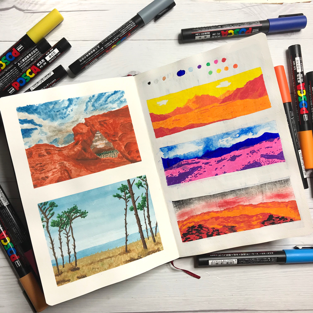
There was also a page where I had covered a pretty bad doodle painting – learned my lesson, watercolours are not the right medium for I-have-no-idea-where-this-is-going-doodles, since you can’t overpaint things. I covered it with white acrylic paint and after that didn’t really have any medium to go on top of that. So, I got myself a pack of Posca pens and then had absolutely no clever ideas how to fill the page. In the end I just continued with the landscape theme from the page on the left which I did in Arteza gouache (I also made a video on gouache a while back). Turns out that it’s really difficult to blend Posca pens, so I didn’t really have enough values except in the orange-yellow-red spectrum. Probably not quite the right style for these kinds of pens! But hey, at least I like the one on the top with the yellow sky! Believe me, even the kinda failed ones are still better than what was underneath before my coverup operation 😂
© Lilly Schwartz
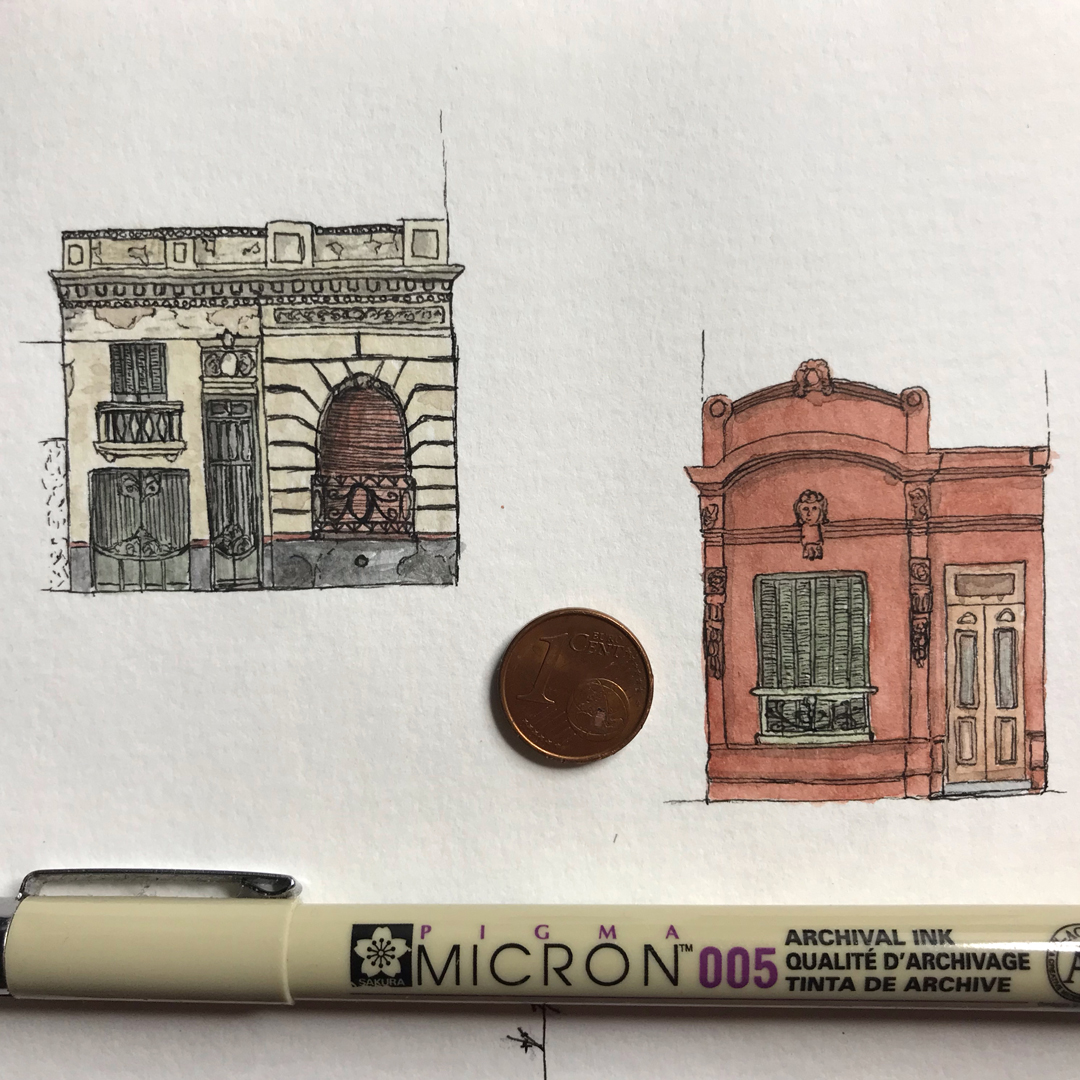
There was also a small space on another page where I had drawn a tiny little Buenos Aires town house in one corner (the one on the left). I decided that it should have a companion house and drew the one on the right. It was done with my thinnest Pigma Micron and my earth tone watercolour palette.
© Lilly Schwartz
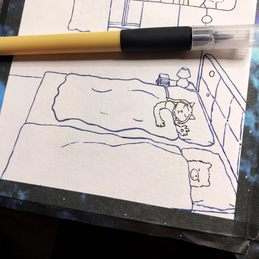
I then had an idea for a full page not related to the rest, which I penciled and inked pretty much immediately. I used my thinnest Kuretake Bimoji brush pen for the characters. This one is by far my favourite brush pen! It’s stiff enough to make a thin line with a lot of control, but makes a thicker line when you apply pressure, so you can vary the line weight quite a bit, but still have lots of control and don’t have to bother with a dip pen and an open ink bottle. And best of all, it’s completely watercolour and Copic proof, yes even with super light colours! The rest of the lines I did with Faber Castell brush pens. I love these for the wide selection of colours, they work great for line and wash type watercolour stuff, but it’s a lot harder to get a thin line with them, definitely better for bigger pieces. There are like 60 colours, but I definitely use the terra set the most. After I finished inking this drawing I was a tad unsure about the actual colouring and wanted to try some lighting scenarios first.
© Lilly Schwartz
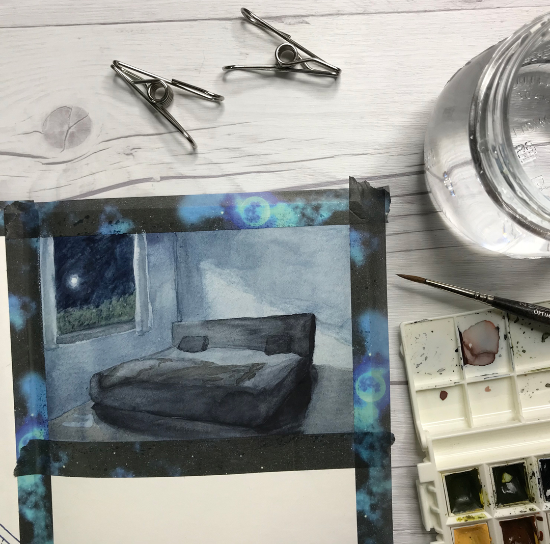
Here is a little study I did with only thin pencil outlines as a guide of a room lit by moonlight. I lost the outlines pretty much immediately, so it was a bit touch and go there for a while, but I do like the outcome. It was mostly Payne’s Grey and Indanthrene Blue for this one. After the study I was still uncertain about the colours for that drawing – I think I have the main panel figured out, but there is a second one that might need one more study to decide on the final combination.
© Lilly Schwartz
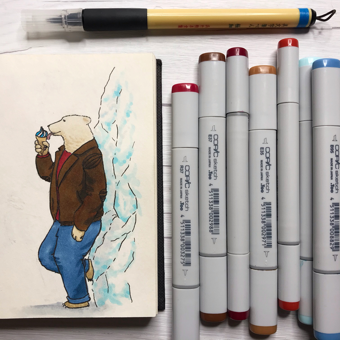
On the next day I didn’t really have time to do something as involved as a watercolour painting though, so I decided to finish a polar bear drawing in my character sketchbook that I penciled over the summer (to cool down, it was so hot that day!) There will be a lot of polar bears in my comic, so I really wanted to practice them and even got myself the perfect polar bear Copic colours: E40, E41 and E43. That Kuretake brushpen is a life saver for such light colours, no smudging even with them!
And after that it was suddenly October, i.e. time for inktober! After the ink drawing the other day I had sort of decided not to participate this year, because I have so much other stuff to do and didn’t want to restrict myself in medium when I finally feel unstuck on the whole comic front. My polar bear character did make me feel like drawing more characters though and they are fairly quick in comparison. So, why not do a little character design challenge for inktober? It’s all ink and brush pens, just that Copics are alcohol based ink rather than water based and have a rather broad tip.
By the way, I really wanted to share a link to that weird but wonderful Kuretake Bimoji brush pen! I saw it in a video and was trying to find out what it was for several days before I finally figured it out! I thought I wanted to give you guys a head start. Without knowing any Japanese it was really hard to find, and the person who recommended these pens in the video had forgotten the name too, since there is only Japanese writing on it. In case you’re doing inktober this year, you will probably love this pen! You’re welcome 😉
© Lilly Schwartz
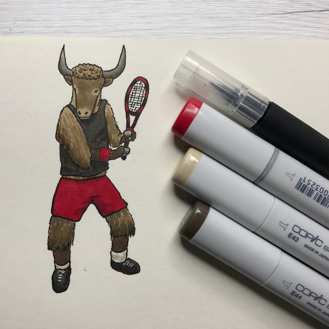
So, for inktober day 1 I sat down to make myself a list of animals with a random list generator, numbered them all and tackled the first prompt: It was supposed to be a yak character. Yaks have really funky fur that is so long that it reaches about halfway down their legs. What I really like about this one is his curly hair on his head though! Why did I make him a tennis player? No idea, but my guess would be that yak sounds like “yuk” and sports are kinda yuk 😂 Don’t @ me 😆
Well, unstuck indeed! What a productive week of drawing and painting! I’m curious to see where my comic drags me next. At some point I definitely have to get to practicing those spaceships, but that’s still a long way off! For now more characters it is!
PS: The links for my drawing supplies in this post are affiliate links with which you can support what I do with no additional cost to you. And using these link helps me out no matter what you get! You can also buy me a roll of film on Ko-fi if you feel like it! Why help out? Well, just look at the price of one of these Copic pens or a roll of my favourite HP5+ and you’ll know why! Whelp!